Motivation: The basic stock chart is limited in providing insights for short-term and day-trading investors. For instance, a typical stock chart does not contain display historical trends on intraday and overnight price changes. In addition, dates of key events, such as quarterly earnings announcements, are omitted from general stock charts, despite being directly responsible large price swings. Hence, the visualizations here are meant to bridge these gaps by providing alternate, yet essential, perspectives on historical stock price trends to empower short-term investors on making data-driven transactions.
Data Sources: The datasets for this analysis were obtained from Kaggle. The datasets included several years of daily stock prices as well as information on dividends and earnings.
Target Audience: The target audience for these visualizations are short-term investors, looking for a data-driven edge in forecasting stock price movements.
Standard
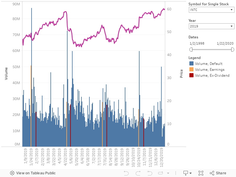
Description: The Standard chart displays the line chart of the stock's daily close price and volume. The volume bar chart also highlights the dates of Earnings Announcements (color=yellow) and Ex-Dividends (color=red).
Instructions: This is basic chart that's used in many finance portals. One can use the chart to see the stock's price action compared to volume. An increasing volume shows the conviction of buyers and sellers in either pushing the price up or down, respectively. For example, if the stock trend heads up and volume increases as the price moves higher, it shows buyers have an eagerness to buy; this typically happens with larger moves to the upside (positive returns).
Candlestick
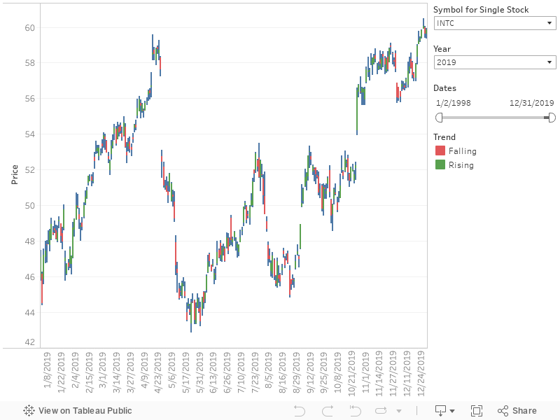
Description: The area between the open and the close is called the real body, price excursions above and below the real body are shadows (also called wicks). Wicks illustrate the highest and lowest traded prices of an asset during the time interval represented. The body illustrates the opening and closing trades.
If the asset closed higher than it opened, the body is green, with the opening price at the bottom of the body and the closing price at the top. If the asset closed lower than it opened, the body is red, with the opening price at the top and the closing price at the bottom. Thus, the color of the candle represents the price movement relative to the prior period's close and candle represents the price direction of the period in isolation (red for a higher open and lower close; green for a lower open and a higher close).
Instructions: Candlestick charts are a visual aid for decision making in stock. Looking at a candlestick, one can identify an asset's opening and closing prices, highs and lows, and overall range for a specific time frame. For example, when the bar is green and high relative to other time periods, it means buyers are very bullish. The opposite is true for a red bar.
A candlestick pattern is a particular sequence of candlesticks on a candlestick chart, which is mainly used to identify trends.
Daily Change
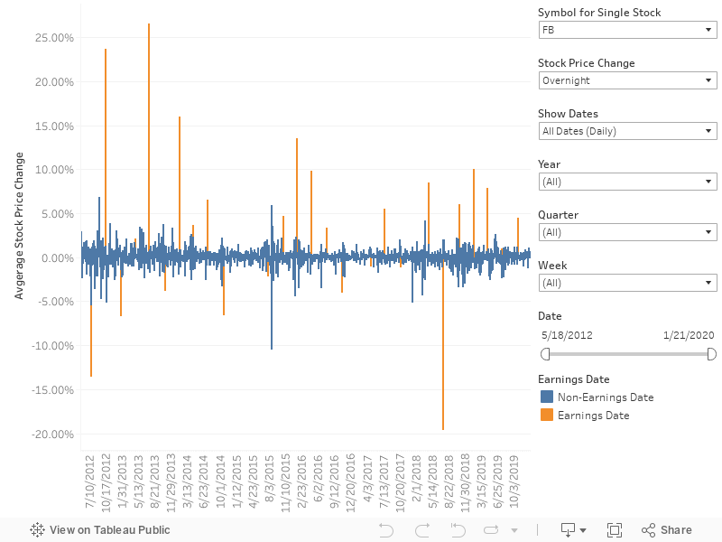
Description: The Daily Change chart complements the typical stock chart by visualizing daily price movements, either across the same day or overnight. In addition, Earnings Dates are specifically labeled given their tendencies to trigger large price swings. Thus, the Daily Change chart delivers insights to short-term investors for identifying low-risk, high-reward opportunities.
Instructions: The Daily Change chart is designed to show either Same Day or Overnight price fluctuations for a single stock. Data points for Earnings Dates are highlighted (color=orange) and can be extracted using the Show Dates filter.